 Hue Plan 휴플랜
iPhone Timetable Widget: Home & Lock Screen Schedule Widgets
When your day and your week are visible without opening an app, sticking to a plan gets much easier. This guide covers the widget types and sizes on iPhone, how to add a schedule widget to your home screen and lock screen, sample layouts for students and professionals, and what to check when a widget stops updating.
iPhone home screen widget types and sizes
Home screen widgets on iPhone come in fixed sizes. Small takes the space of four app icons, medium takes a wide strip of eight, and large takes sixteen. iPad adds an extra large size that spans most of the screen width. The same widget shows more or less detail depending on its size, so it helps to decide what you want to see first and pick the size from there.
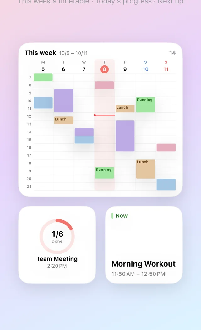
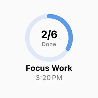
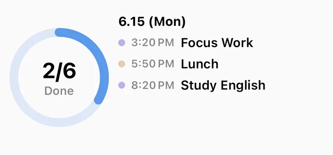
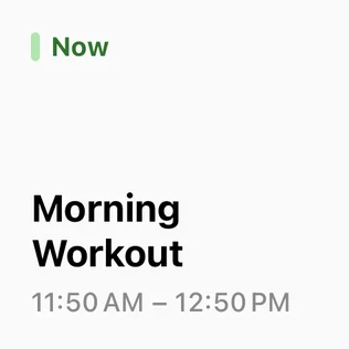
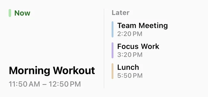
Schedule widgets usually fall into four types. A list widget shows today's events in time order. A timetable or grid widget lays out a day or a whole week in cells, much like a printed class schedule. A next-up widget shows only the closest upcoming event, in large type. A progress widget shows how much of today's plan you have completed. Single-value widgets like next-up and progress fit the small size well, while lists and weekly timetables need medium or larger.
Widgets of the same size can be stacked into a Smart Stack. You keep several widgets in one slot and swipe up or down to switch between them, which saves space on a crowded home screen. A common setup is one large weekly schedule widget plus a small stack that holds next-up, calendar, and progress.
Using lock screen schedule widgets
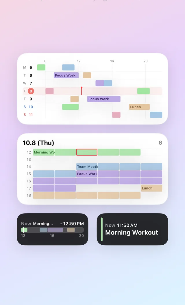
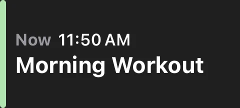
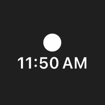
Lock screen widgets are smaller than home screen widgets and are drawn in a single tint. There are three shapes: circular and rectangular widgets go in the row under the clock, and inline widgets sit in the one-line date area above the clock. The row under the clock fits four circular widgets, two rectangular ones, or two circular plus one rectangular.
You look at your lock screen dozens of times a day, which makes it the most effective place for a schedule widget. You can see when your next class or meeting starts without opening a notification, and the moment you pick up your phone you are reminded what comes next. Space is tight, though, so choose one or two things rather than trying to fit everything.
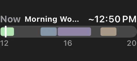
A good combination is a rectangular widget that shows the shape of your day, such as a today-flow view, plus a next-up widget in an inline or circular slot. That way you see both the overall day and the very next thing on your plate. Keep in mind that anyone near your phone can read the lock screen, so short or vague titles are a good idea for private events.
How to add widgets to your home and lock screen
Home screen: 1) Touch and hold an empty area of the home screen until the icons jiggle. 2) Tap Edit (or +) in the top-left corner and choose Add Widget. 3) Type the app's name in the search field (for Hue Plan, search "Hue Plan"). 4) Swipe left and right to pick the widget and size you want, then tap Add Widget. 5) Drag it into place and tap Done.
Lock screen: 1) Unlock with Face ID or Touch ID, then touch and hold the lock screen. 2) Tap Customize and choose Lock Screen. 3) Tap the widget area under the clock to open the widget list. 4) Find the app and pick a circular or rectangular widget. For an inline widget, tap the date above the clock instead. 5) Tap Done. If you use several lock screen wallpapers, each one has its own widgets, so set them up separately.
Smart Stack: touch and hold a widget and drag it on top of another widget of the same size to create a stack. Touch and hold the stack and choose Edit Stack to reorder it or to turn off Smart Rotate, which otherwise switches widgets automatically based on the time of day. If you always want your timetable on top, turning off Smart Rotate is the better choice.
iPad: the steps are the same as on iPhone. The larger screen makes iPad a great place for large and extra large widgets, and lock screen widgets are available on iPadOS 17 and later. Widget layout can look different in landscape, so check it in the orientation you actually use.
Recommended layouts for students and professionals
College student: put a large weekly schedule widget at the top of your first home screen page. It works like a class schedule taped to your desk, with Monday through Friday visible at once. Below it, place two small widgets side by side: next-up on the left so you can check where your next class is, and today's progress on the right. On the lock screen, add a rectangular today-flow widget and a circular next-up widget. During exam season, add study blocks to the same schedule so your classes and study time show up in one widget.
Working professional: put a medium today grid or today list on the first page, with a small next-up widget beside or below it. Turn the remaining small slot into a Smart Stack that holds today's progress, a weekly bar chart, and a calendar. Use the inline lock screen slot for next-up so the start time of your next meeting sits right above the clock. If you like to scan your whole day before work, the grid reads better. If your day is packed with back-to-back meetings and order matters most, the list is easier to read.
The most common mistake is adding too many widgets. When three or four schedule widgets compete on one page, none of them stands out. One large widget for the thing you check every day, either your week or your day, plus one small widget for supporting information is usually enough.
What to check when a widget won't update
Refresh timing: iOS widgets are not live screens. The app prepares content in advance, and the system swaps it in at scheduled moments. iOS also limits how often widgets refresh to save battery, so a change you make in the app can take a few minutes to appear, and longer in Low Power Mode. Opening the app once and closing it usually brings the widget up to date right away.
Changes from another device: an event you edit on your iPad or Mac only appears in the iPhone widget after iCloud has synced it to the iPhone. Make sure sync is turned on and the phone is online.
Paid features: in many apps, widgets are a paid feature. In Hue Plan, widgets are part of Premium, so check that you are signed in with the same Apple Account you used to buy it.
Week start day: if your weekly timetable starts on Sunday when you expect Monday, check the app's week start setting. Hue Plan widgets follow the week start day you choose in the app.
Still stuck: remove the widget and add it again, or restart the device. Right after an app update, new widgets sometimes do not show up in the widget list until you restart.
Hue Plan widgets at a glance
Hue Plan is a time-blocking planner where you paint your day in pastel color blocks, and those colors carry over to its widgets. Version 1.2.1 added a large set of widgets: nine in total across the Home Screen and the Lock Screen.
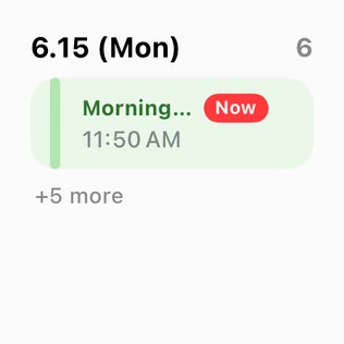
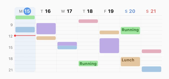
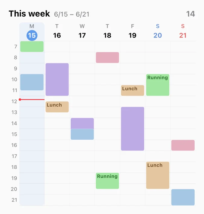
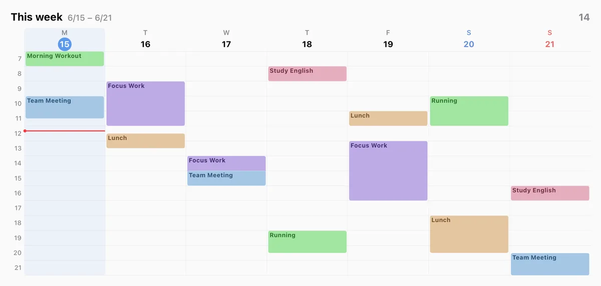
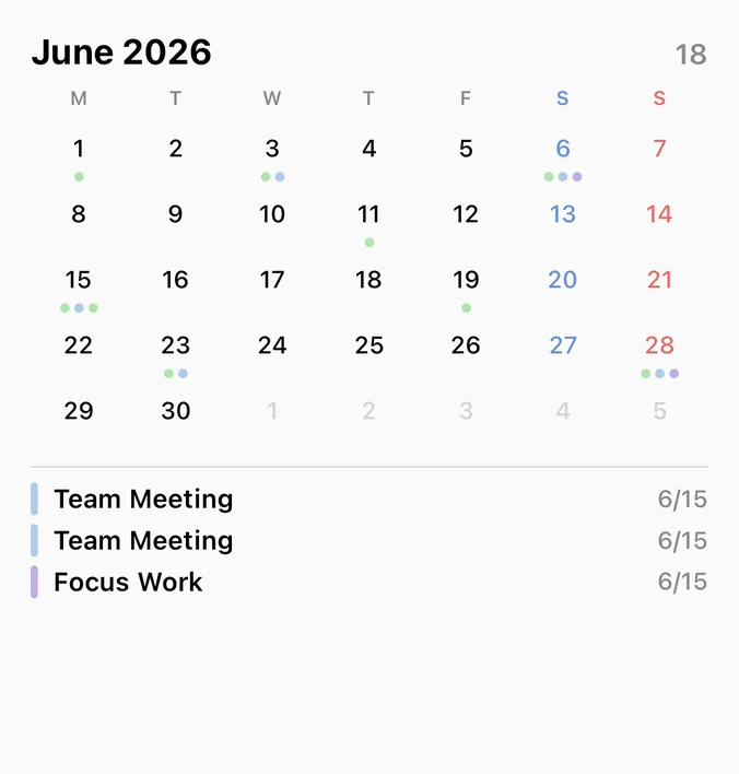
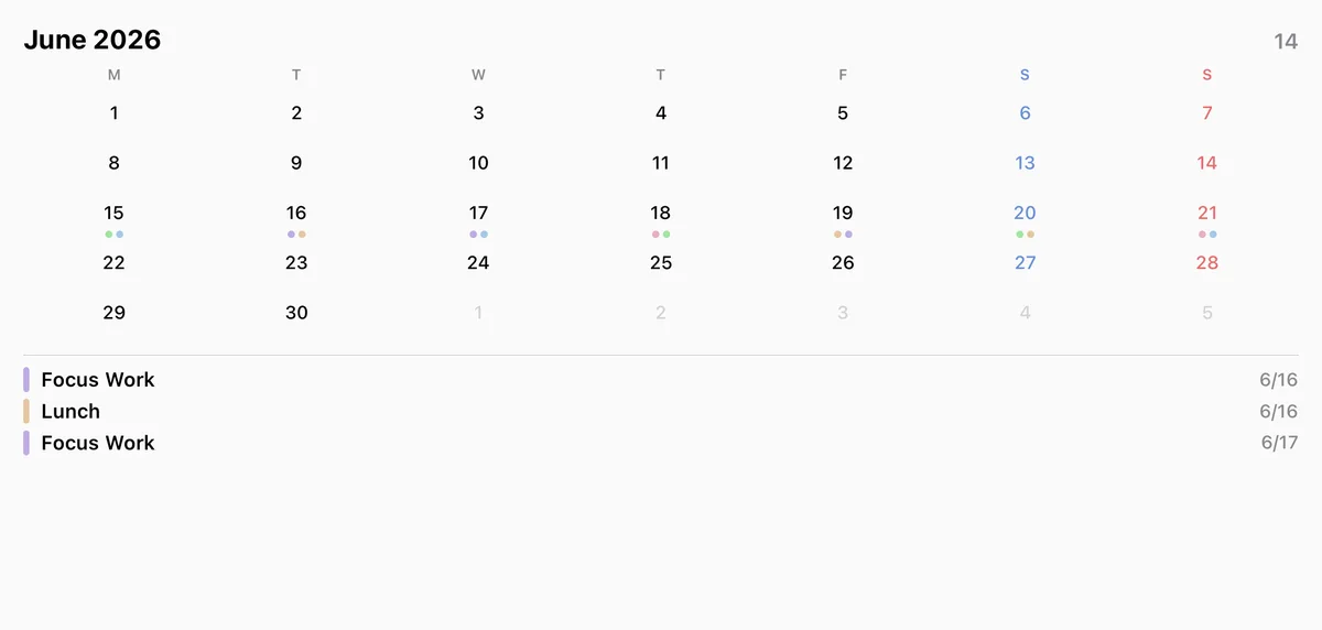
Home screen: Today list, Today grid, This Week timetable (small through extra large), This Week compact, Today progress, Next up, This Week bars, and Calendar. Lock screen: Today flow (rectangular) and Next up (circular, rectangular, and inline). The This Week timetable lays out each day in blocks like a class schedule, and This Week compact squeezes the whole week into a smaller space. All widgets support dark mode, and iPad gets the larger sizes.
Widgets are a Premium feature. Premium is a one-time purchase ($2.99), not a subscription, and it also unlocks Apple Watch, week and month views, iCloud sync, and Review. There is no login and no server account. Your data stays on your devices and in your own iCloud.
Every widget in every size
24 Home Screen combinations and 4 Lock Screen ones. The same widget shows different information at each size. Extra large is iPad only.
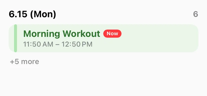
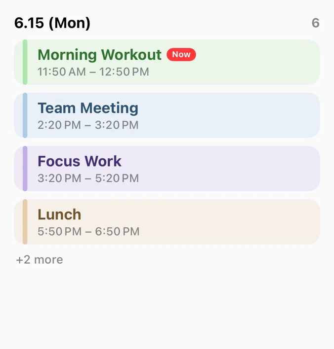
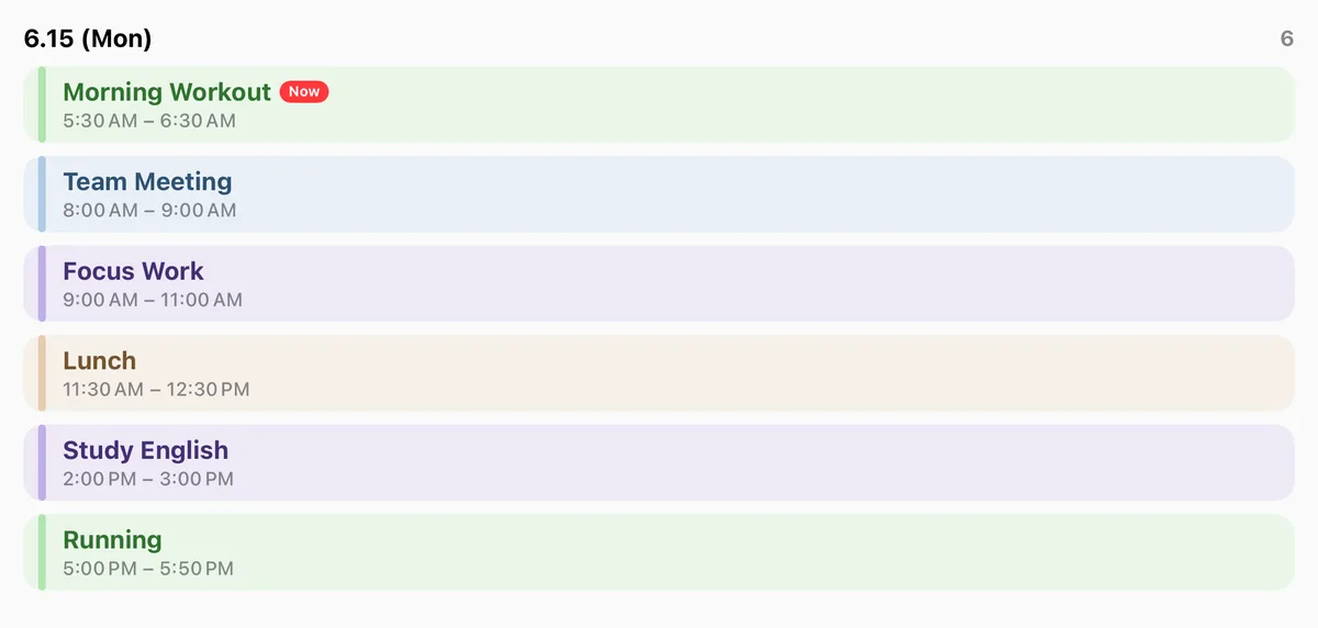
Today's Schedule 4 sizes
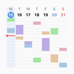
This Week Timetable 4 sizes
Today Grid 3 sizes
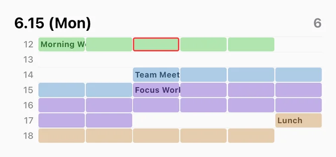
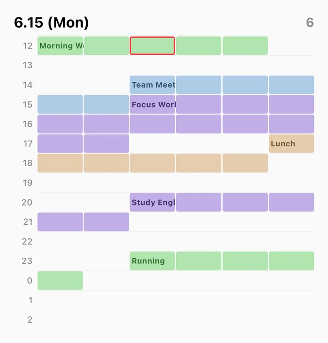
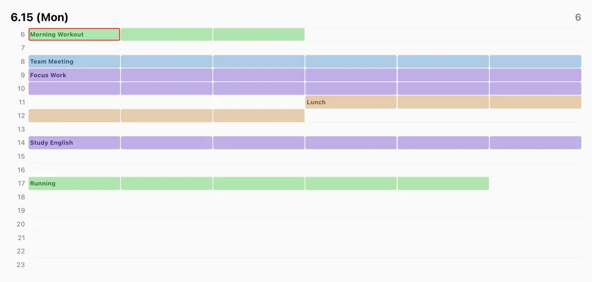
This Week Compact 3 sizes
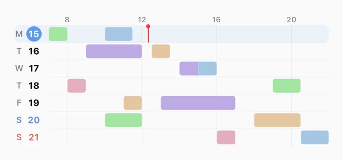
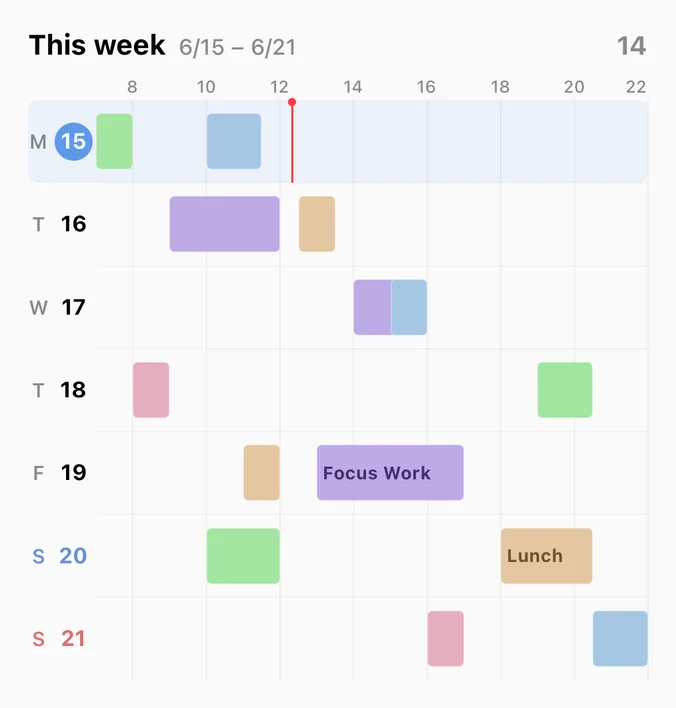
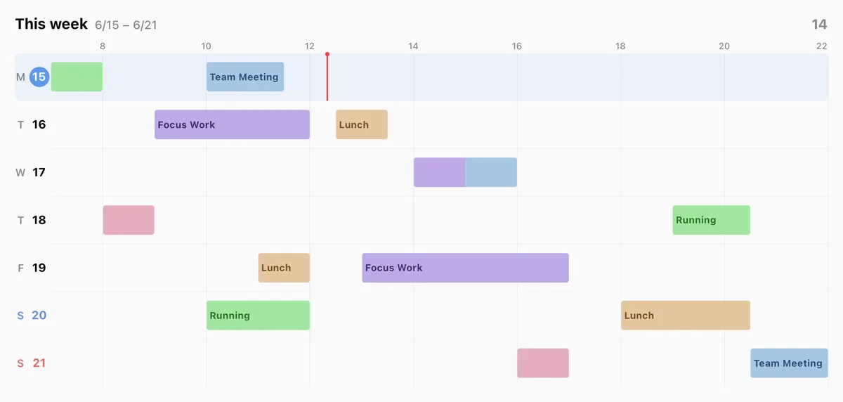
This Week 3 sizes
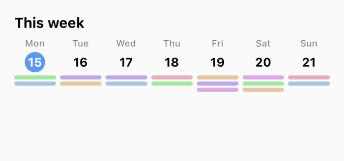
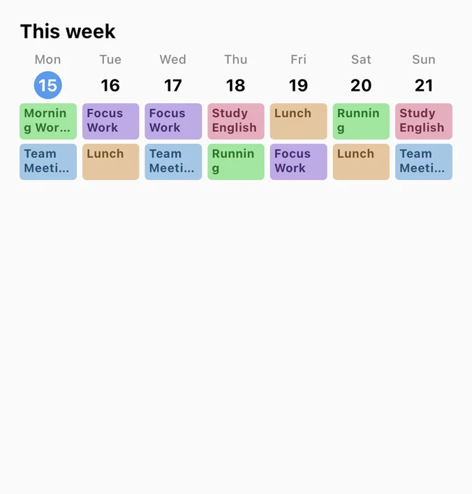
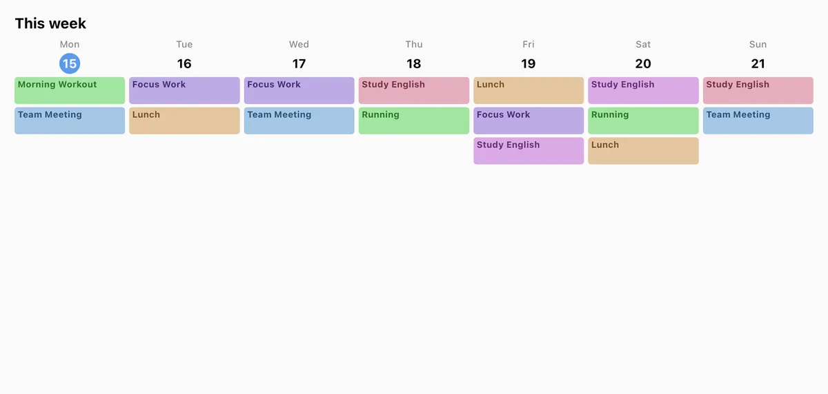
This Month 2 sizes
Today's Progress 2 sizes
Next Event 5 sizes

Today's Flow 1 size
FAQ
Can I show my whole weekly timetable on the iPhone lock screen? +
Can I add or edit events directly from the widget? +
The widget does not appear in the widget list. What should I do? +
Are Hue Plan widgets free? +
 Free to start · Premium one-time purchase